Saturday, 6 August 2011

Day 3 without my iPhone


Day 3, and I'm doing okay without the iPhone. I haven't become too grumpy to live with, and I haven't shriveled away into a sobbing heap in the corner of a room.

One app that I really could have done with earlier today was Teamviewer. It's available on the iPad too, but when I was out and about I didn't have the iPad with me. Essentially what the app does is it allows you to remotely access any computer that you have the program running on.


I have it running on my office computer, so any time I need to get a file from there, I just log on to my iPhone and the phone screen mirrors the monitor of my office desktop. I then have access to not only the files, but also the programs on the desktop.

So, on occasion, I have actually run AutoCAD on my iPhone, although technically the program was running on my desktop, using it's RAM and processor speed. The only thing that might, literally, slow you down on the iPhone is if you have a slow internet connection, because that's how it connects to your remote computers. So it won't work unless you have decent 3G or wi-fi coverage.

Another possible annoyance is the size of the iPhone screen. This is where Teamviewer for iPad comes in handy: the real estate of the larger screen makes navigation around the remote monitor much easier.

The app itself is free, although if you use it for commercial purposes you are informed that you should purchase the Pro version (currently €80). I use my version for personal use only, so for a free app it's extremely powerful.

So while I was out and about today, I needed to look up a phone number. Normally I'd have had that information to hand on the iPhone, but today I didn't have the option of going online, connecting to my office desktop, and looking up the number.

As with most of my gripes so far, the reason why I miss the iPhone can be summed up as "convenience". So far, I've managed to get around most of the bits and bobs that I've missed, but at a much much slower pace. I've only just been able to look up that number now that I've arrived home, but I needed it 3 hours ago, and if I had had my iPhone, I wouldn't have had to wait.


Photo from "myfitnesspal.com"

Friday, 5 August 2011

Day 2 without my iPhone


So today hasn't been too bad, but there are a couple of reasons for that.

Firstly, I found an update to the Opera Mini browser for the Tocco, which makes accessing websites a good bit easier than through the Samsung browser. Also, I found that Google have an app for that phone to make setting gmail accounts quite easy. So my main gripe yesterday was kind of balanced out by that (though the mail experience on the iPhone is way more slick).

Secondly, I've been at home all day, so I've had the Mac on most of the time, checking in and out of various sites.

When I got into Opera Mini on the Tocco I found that the shortcuts I added first were for social network sites. Opera Mini allows me to set up a home screen in the browser with icons for my bookmarks, a little like the way Safari does it on a Mac. Handy, but the shortcuts only bring you to mobile versions of sites by default (and the screen is too small to deal with the optional desktop view).

So the Apps I miss today are: Social Networking apps. As I mentioned, the Tocco does have the mobile versions of these apps, but they're fiddly and hard to get at: for example, it just took me 8 buttons presses and 1min 1 second to open Facebook on the Tocco. What would it be on the iPhone? I'd estimate 2 presses (if you include unlocking) and 5 or 6 seconds?


Facebook on the iPhone is just so simple to use. Nearly all of the desktop features can be found in this app. To be honest, I can't remember thinking "why can't I do this on the app, I can do it on the desktop version". So if you're like me, a casual user, the app has all the features you'd want. The fact that it's just there, as an icon you can click on and get straight into the app, is brilliant. If they ever update it to include the video calling function that's available in the full version, it will be excellent. This has such a head-start on google+ that I can't foresee a time soon when it will be unpopular.


Google+ is still a work in progress really. Android users tend to get updates before they hit the iPhone, but the fully finished product has yet to be launched to the general public. (Having said that, it's very easy to get an invitation to join the beta version). This app has a lot to do to catch up with the lead that facebook has at this stage. A couple of things mark it out as special though: the Circles function is really great for making sure your posts are seen only by those that you want to see them. Also the Huddle function sounds great, though I've yet to try it (it's like group chat, but with video). I don't have as many contacts on this as I have on facebook, but I miss being able to check in on it without my iPhone.


Twitter and Tweetdeck both do pretty much the same thing. If you have multiple Twitter accounts, either of these apps will allow you to view messages, tweets, profiles etc. And of course you can tweet from each of them too. What makes Tweetdeck different is that you can also add facebook accounts to it and view posts from facebook alongside Twitter feeds. It's a handy one-stop-shop for multiple feeds.


Of all the social network sites, I probably use LinkedIn the least. It's reserved for a more professional means of networking, and doesn't have any huge personalisation options. You can add a profile picture, and that's about it as far as photos are concerned. However, it is handy for keeping in touch with colleagues (or ex-colleagues) with whom you are not interested in sharing anything too personal. The iPhone app for LinkedIn is far from perfect, in that compared to all of the above apps it mirrors it's desktop version the least. Even sometimes I find that not all status updates come through properly. Not perfect, but it's okay.


With all of the above, there are ways to view them on the Tocco. But for speed and convenience, it's hard to beat a native app compared to a mobile version.

So in Day 2 I've been okay without my iPhone simply because I've been within close reach of my Mac all day. Tomorrow and the next day will be different, and I may well feel far more cut-off from the world that I did today.


Photos from "supersized.wordpress.com"   "simplyzetsy.com" "googleplus.com" "crunchbase.com" "lindsaybrowning.ie"

Thursday, 4 August 2011

Day 1 without my iPhone

So the microphone has started giving trouble on my iPhone 4. It started about a month ago, but just like going to the doctor, I've been putting off the inevitable.......a trip back to Apple for my iPhone.

Apparently it's a known issue with the iPhone 4, and it manifests itself as intermittent microphone break-down. About once or twice a week it would stop working so that people on the other end of a call couldn't hear me. When I tried it on speakerphone, they still couldn't hear me. In fact, the only way to make a call when the problem occurred was to use the Apple headset with built-in mic. Not a very handy solution.

Anyhow, Apple took my iPhone away this morning, for about a week or so (I'm told.....let's hope it's no longer).

So that means I have to use an old phone that I had lying around the house. I had a choice of 2 handsets:
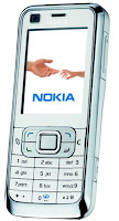
Nokia 6120  


or

Samsung Tocco 

Both are handsets I used in the past for a year or so. I tried the Nokia first, thinking the novelty of a small phone would be fun. It wasn't. The sim card lasted about 20 minutes in it: I found the screen was way too small and the navigation with the buttons far too slow for my liking.

I should say, this series of posts won't be about knocking either of these phones. They were both pretty much state of the art when they came out first. The times have changed, though.

So I tried the sim in the Tocco next, and it's been in there all day now. It's still a bit of a pain using the native Samsung browser, and the screen is nowhere near as responsive as the iPhone. More importantly, it's the lack of apps that is the main problem. I will stick with the Tocco until I get the iPhone back, because at least it doesn't have fiddly buttons and the screen is a reasonable size.

Over the next few days I'll report on how I'm getting on. I already sorely miss the iPhone, and I reckon my time away from it will really highlight the things I like and miss about it most: the apps.

So watch out here for some renewed enthusiasm for the apps I used to use every day!

Number 1 app that I miss: e-mail. This CAN be set up on the Tocco, but nowhere near as easily as on the iPhone, and with no unified inbox. So, after spending 20 minutes trying to set up an email account on the Tocco, I gave up. So it means I won't be able to check my mails as often as before. Good or bad thing? Time will tell. Right now, it has frustrated me that I couldn't check mails whenever I wanted (waiting for the coffee machine to finish filling the cup, waiting in the queue at the phone shop, and in that rush-hour traffic jam).


Photos from blog.mobiles.co.uk  mobile.engadget.com iphoneangels.co.uk

Friday, 29 July 2011

Classes - Timetable (iPhone)

Classes is a timetable app, and it looks after that function very well. I tried out several timetable apps before settling on this one. This currently costs 79cent, but it works better than other free timetable apps.

Some nice things about it include a landscape view that shows the whole week at a glance. When you open the app first, it shows a day-view and a countdown timer to the start of the next class. Entering the details about the classes takes a bit of time, if you want to include ALL of the details such as teacher name, location, type of class (lecture/turorial/practical etc.), and notes about each subject. But if you only want the bare essentials (name, location, time), then the timetable can be built up reasonably quickly.

There is great flexibility in adding new types of classes (for example if you want to add "workshop" as a class type, then you can, even though it's not one of the pre-defined class types).

Students might get more out of this app than teachers, as it allows students to enter details about assignment deadlines and homework for each subject. Not that useful for teachers, the way it's set up, but you could use that function to some degree. Also, the field for adding details about the teacher for each subject is not much good if you're the teacher.

I find it very handy at the start of each term, as it allows me to have my timetable with me and accessible when I'm still trying the learn the new routine.

The one missing feature, that would make this app perfect, is a journalling function. I like to keep notes of where I finish each lecture so that I know where to pick-up next time around, and currently I use a diary app for this. If Classes had that function, it would mean I could keep my timetable and records of progress all in one place. I've asked the developer to add this in, so it remains to be seen if an update will have this feature. You can make notes on each class session, but the notes are repeated every week, kind of locked in to that session, so it doesn't really work as a journal.

If they put the journal in it would get 10/10. As it is, it's 7/10 (and that's easily the best timetable app I've downloaded)

Find details here

Wednesday, 27 July 2011

Blogpress (iPhone and iPad)


I use this app to write blogs on both of my iDevices. I have accounts through Blogger (google), but this app works with all the blog hosts, such as WordPress, Tumblr, Joomla, TypePad and Live Spaces. Adding a blog from these providers is really quick and easy.

Once the blog has been added, writing new posts is very easy. You can add links, pictures and use some RTF font effects too (through HTML, but you don't need to know how to code, the app looks after that for you).

You can save posts on the device for editing and later publishing, or you can publish directly after writing the post. You can also view posts that have already been published, and edit them if you need to.

There's also a facility to automatically send your posts to a twitter and/or facebook account, so sharing is taken care of for you without any further effort.

This is a great app, although the current price of €2.39 is a little steep, in my opinion. If you have a good internet connection all the time, you can do your blogging through the web page of your service provider instead. Where Blogpress really comes in handy is when you want to write/edit while offline.

9/10

Blogpress website

Tuesday, 26 July 2011

MobileRSS (iPhone and iPad)


I use the free version of this app, although you can remove the adverts in a version that currently costs €2.39

One of the most useful things about this reader is that you can set up multiple accounts, and so you can follow as any number of users. It can synchronize with all the usual reader formats, and in the month or so that I've been using it, it hasn't had any issues with not being able to sync.

You can easily set up folders for different types of feed categories, which is handy. It means that the main screen doesn't get cluttered if you have a good number of subscriptions.

It's really easy to set up accounts and settings (for example, you can set the app to only download images if the device is connected via wi-fi), and it automatically downloads the feeds so that they can be read even when you are offline.

One of the other great features is the forwarding options available. For example, you can forward feeds to all the usual formats, including emailing a link, Instapaper, ReadItLater, Evernote, Facebook and Twitter. Very handy for sharing good stories. And all of the above are configurable, so if you have a Facebook account set up within the app, it'll make the sharing seamless.

Hard to fault this app, really. I've tried a few other readers, but this one is just about the best one I've come across, particularly seeing as it's free!

9/10

Thursday, 21 July 2011

Friendly for Facebook (iPad)


This is just about the best way to experience facebook on an iPad. For now, anyway. Apparently a native facebook app is being worked on at present, and it remains to be seen if that will be better.

As an alternative, you can always log on to the full website using Safari, or the slightly more cut down mobile version at m.facebook.com

But what Friendly does better than either of the solutions using Safari, is the easy navigation and clear layout. In most cases, there is no need to pinch to zoom items, whereas this is nearly always necessary in the Safari solutions.

Viewing photos on Friendly is very easy and intuitive. Adding photos from the albums on the iPad is very easy too.

All the usual buttons from the web version are there, but when you press the "game" button, the app flings you into the web version, and the flash games don't work on the iPad, of course. The game button is a waste of space in the app for that reason alone.

Things like events, places, groups and notes are all present and correct. You can edit your profile within the app to (unlike the google+ iPhone app), which is handy for making changes.

It's really easy to set up multiple users for the app too, so you can switch between up to 4 different facebook accounts very quickly.

I have found that it trips out occasionally, so there's obviously a bug somewhere in there still. This can be annoying, and it means starting the app up again from the springboard.

Overall 8/10

http://itunes.apple.com/us/app/friendly-for-facebook/id400169658?mt=8